


BMW or Bayerische Motoren Werke is a German pioneer in vehicle manufacturing. But many of you won’t be familiar with the history that the brand has. The history dates back to 7th March 1916, when an aircraft manufacturer, Bayerische Flugzeugwerke AG came into existence. The first product from the company was a 6-cylinder SOHC aircraft engine named BMW IIIa. But what’s more interesting than this is BMW’s Logo. Some say it’s a propeller inspired logo which they justify by saying that the company used to build aircraft engines. Is it a reality? Or is it something else? Before answering the question, let’s dwell into the history of BMW.
BMW | The Name and the History
Rapp-Motorenwerke GmbH, a company that was set up back in 1913 used to produce engines for the aircraft. During the first world war, Rapp motors supplied the air force for the German side. At that time, automobiles had no profound impact in everyday life of people. For long distances, people preferred using trains.
But where is the BMW name? Rapp changed its name to Bayerische Motoren Werke GmbH or the BMW.
What’s In A Name?
When we talk about a brand, everything lies within the name. In 1918, the company’s name, Bayerische Motoren Werke GmbH, was registered. But when the first World War ended, Germany was forbidden to build aircraft engines due to the Treaty of Versailles. BMW had to stop the production of engines and started making railway brakes and built-in motors. This run became so successful that the Berlin-based brakes company Knorr-Bremse AG bought majority shares of the company thus becoming the owner. BMW name was gone. But for how long?
BMW Again!
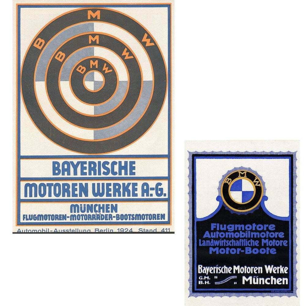
The name was not able to stay away for long. In 1922, Camillio Castiglioni, the major shareholder in Knorr-Bremse AG, bought the BMW company name and took over the engine construction operations, employees, production facility and the BMW Logo. He transferred everything to Bayerische Flugzeugwerke AG or BFW. In the same year, the company shifted the factory to Lerchenauer Strasse and the name was changed to Bayerische Motoren Werke GmbH and BMW was once again on the roll.
But what about the Propeller Logo? What is the real truth behind the BMW Logo?
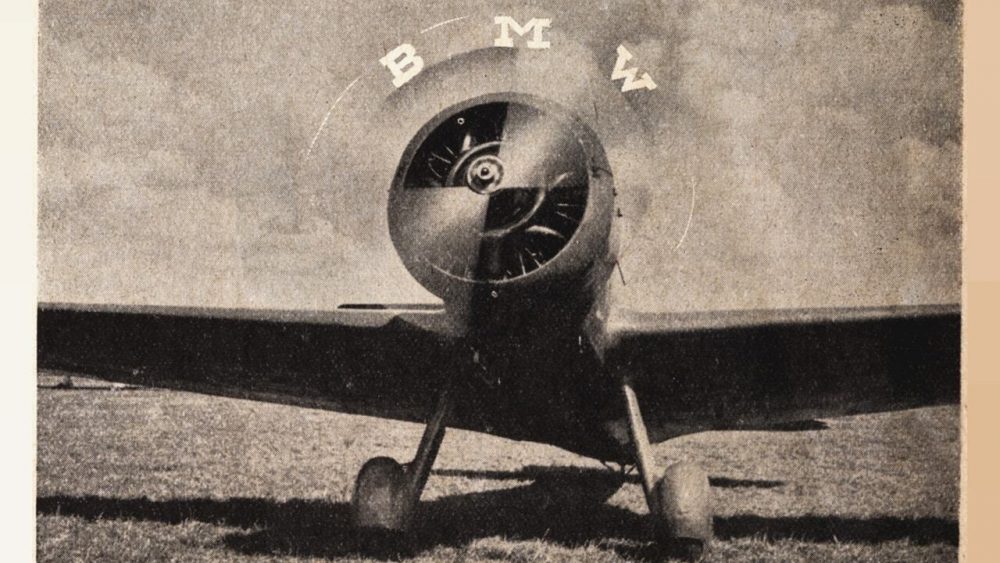
Many people believe that the BMW logo is an imitation of a propeller of an aircraft. But this is just a myth. Back in 1929, a BMW ad showed the logo in the rotating propeller of an aircraft. This is where the logo myth originated. Have a look at the ad.
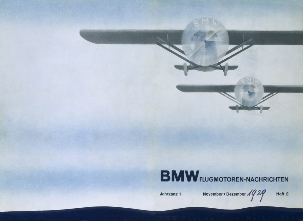
BMW used the popularity gained due to the myth for a very long time. In 1942 also, the company used the same strategy in the company’s magazine.
According to Fred Jakobs, Archive Director, BMW Group Classic, BMW made a little effort to discourage the myth that the BMW emblem was a propeller.
The Actual Story Behind The Logo
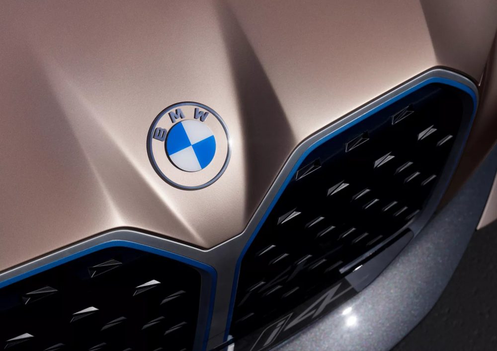
The Logo was born in 1917, with the birth of the name itself. BMW came out of the State of Bavaria and so does the logo. The quarters of the inner circle of the logo contain the colours of state in reverse order. The order was changed as the law prohibited the use of state coats of arms or other symbols of sovereignty on commercial logos. This is why the logo looks like the way it is.
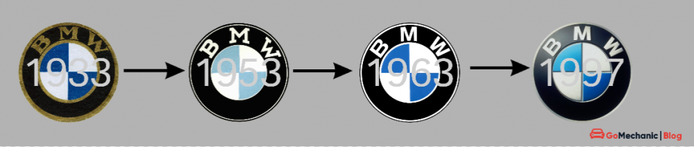
Since then the BMW Logo has changed 4 times. In 1933, logo got its first appearance of what we remember the BMW logo to look like. By the time of the 4th revision, i.e. 1997, the emblem became the way it looks, oh sorry! used to look. The 3D icon with a subtle colour scheme of black and blue. The silver lining of the logo made it look sophisticated than ever.
Recently the company gave its logo a major revamp session and it looks nothing like the previous ones, except the Bavaria colours at the centre. BMW has ditched the 3D design and opted to go for minimalistic 2D transparent design.
The 2020 BMW Logo: The Emblem Of Future
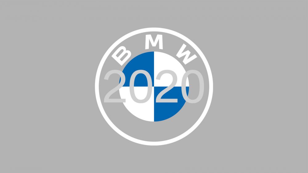
The company states that the new BMW logo is not just a design update, it depicts the stance BMW has for the future of mobility. The logo has been revealed with the unveiling of the company’s electric sedan I4 Concept which is expected to launch in the next year.
Jens Thiemer, Senior Vice President Customer & Brand BMW stated that BMW has become a relationship brand. This new communication logo radiates the openness and clarity of the company. With this new transparent variant, BMW wants to invite the customers more than ever to become part of the BMW world. In addition, the new brand design is geared to the challenges and opportunities of Digitization for brands. BMW wishes to show its presence online and offline in the future. The communication logo depicts the significance and relevance of the brand for mobility and driving pleasure in the future.
What do you think about the new logo motif? Is it just a gimmick or is the company really looking forward to the future? Let us know in the comment section.
