


A trend started in 2020 and is still going long and strong. Well, first it was BMW and then Nissan, after that KIA and now Renault has also become the part of this family. Last year, the luxury carmaker BMW unveiled a completely new logo that was minimal.
Later, the Japanese carmaker Nissan also tagged along with their simple yet sober logo. Now, recently Renault has also stepped into the league and refreshed their logo.
The trend is something that constantly changes. A while back, where the car logos looked more like holograms, the new logos are more minimal and sober.
Renault: The New Logo!
Almost all the carmakers across the globe are slowly shifting the preferred powertrain from IC engines to its alternative like an EV. This switch encouraged Renault and other manufacturers to change their logo.
- Like before, the basic structure and the silhouette of the Renault logo remains the same but this time around it offers more 2D design rather than 3D.
- Also, if you are not aware the new logo resembles the one from 1972. Driving into a little history, it was 1992 when Renault drastically changed their logo. The least has changed until now.
- FunFact: The new logo is Renault’s 14th logo in series and the 9th logo to have the traditional diamond shape.
- Moreover, the company says the logo will slowly make its way into the line-up and by 2024 everyone model will be holding the new logo in bold.
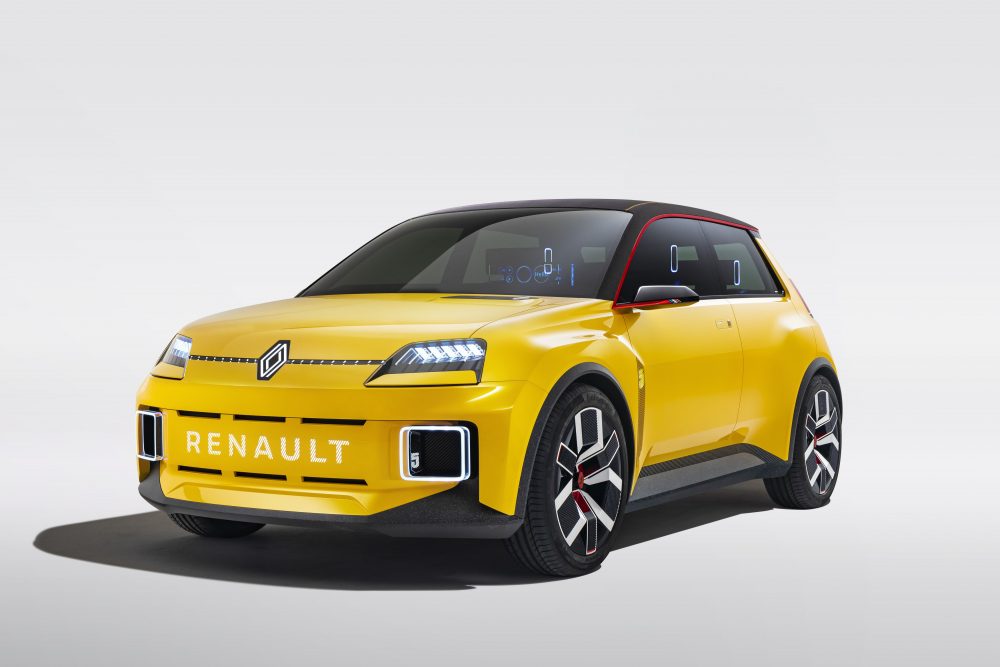
The French carmaker Renault showcased the Logo in the Renault 5 concept electric vehicle.
Renault Future Plans
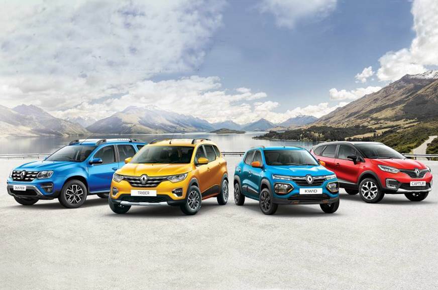
Currently, Renault is on fire as they have a couple of robust and amazing compact and subcompact SUVs along with an affordable MPV. The recent offering is the new Renault Kiger that offers the right value for money with little to no compromise. Also, after Renault and Nissan working together, we can assume that both the companies are up to something big.
Interesting Read: Top 10 Most Googled Questions On The Renault Kiger

Recommended: Renault Kiger vs Nissan Magnite: A Budget SUV Battle?
