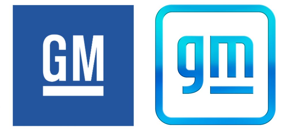
One of the world’s biggest automotive giant General Motors (GM) changed the theme of its logo and revealed a new logo last week. Similar to GM’s old logo, this one is also minimalist. So what has changed? Well, the new emblem gets a total overhaul and looks even more elegant.

To begin with, the new logo gets a complete colour switch. Where the old logo was white text over the blue background, now it is blue text over a white background.

Breaking down the new GM logo
Well, that was just the gist, diving deep we can notice that the new logo has lowercase letters instead of capital in the older version.
- Additionally, now only the ‘M’ from GM is underlined over the underlined GM in the previous logo.
- This emphasizes on General ‘MOTORS’ instead of the previous ‘General Motors’.
- Now the new logo in 2021 gets subtle curved edges over the sharp square in the older version.
The Hidden Message
- This is the first time that GM has given its logo a new appeal since 1964. It is said, desperate times urges us to take the desperate measure.
- GM was not that desperate but with the advancing technology, a new logo would have done great. This is exactly the automotive giant tried to achieve.
- That said, the new logo signifies the companies move to shift to electric vehicles in the future. It is speculated that GM will launch more than 25 new electric vehicles till 2025. Well, not in India. What makes us think this, you may ask?
- Well, the lowercase ‘m’ in the logo is similar to the electric plugs in the USA. But we in India may find it difficult to relate to this significance.
Many of the carmakers from around the world have changed or may change their logos in future. Well, General Motors is the latest carmaker to set foot in this league after Nissan and BMW last year.
So, what do you think about this shift? let us know in the comment section below.
Also, Read Revisiting The Chevrolet Aveo & Aveo U-VA In India
Related: 10 Most Googled Questions About Chevrolet in India, Answered!


