


From hatches to sedans, car manufacturers around the globe working day and night to give us vehicles that become a part of our life. But behind these successful brands is a story that can inspire. And the first glimpse of this incredible journey begins with the logo. So here are 5 iconic brands and the vision behind them. The brands you know the story you don’t!
-
Mercedes Benz
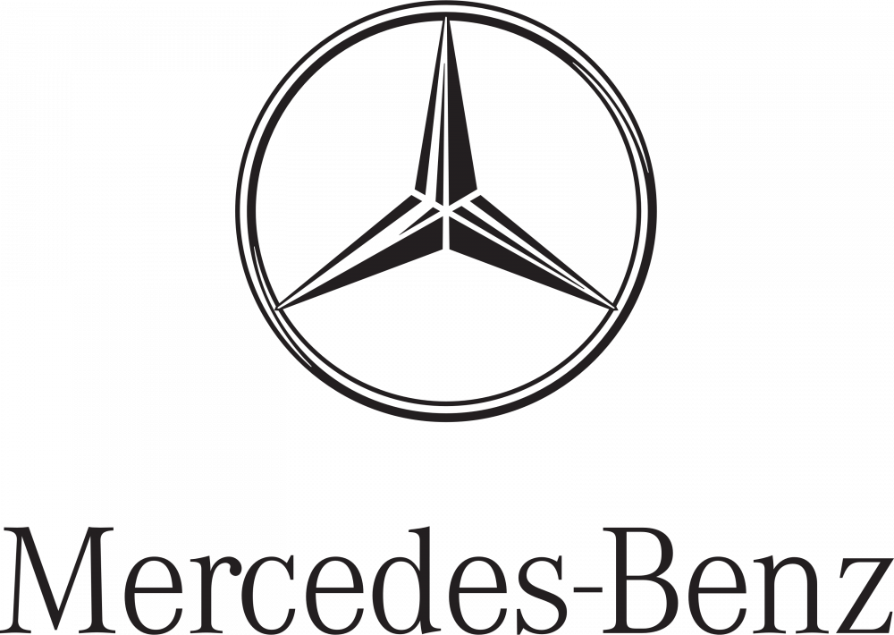
The Mercedes Benz Logo Some manufacturers change their logos every decade in a struggle to establish a credible identity, while others remain consistent for centuries. One such logo is Mercedes-Benz’s three-pointed star. This iconic design has adorned the grilles of millions of quality vehicles.
The original Mercedes-Benz logo was a gold star, which evolved into a white star placed at the centre of a thick circular border with detailing around the edges. Fast forward to the present day, the Mercedes Benz logo is a silver circle with a Three-Pointed Star in the centre. While the logo’s meaning was rooted in family, it now has come to represent the strength and prevalence of Daimler engines on the sea, air and land represented by each spoke.
-
Audi
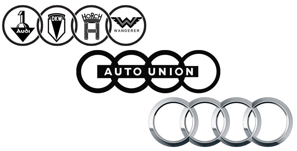
The Journey Of Audi’s Logo The German automaker known for producing classy and fun-to-drive vehicles is identified around the globe with its four-ringed logo. Resembling the Olympic logo, Audi’s emblem goes beyond simplicity. The four interlocking rings in Audi’s emblem actually symbolize the merger of four automobile manufacturers Audi, DKW, Horch and Wanderer that merged to become the Auto Union AG. Here are brief details of the roots of today’s AUDI AG.
When the merger occurred in 1932, the Auto Union emblem was comprised of four interlocking and overlapping rings-with each ring comprising the logo of the participating brand. Eventually, the company logos disappeared, leaving four sharp, silver circles. The polished chrome finish on the rings is a symbol of power and modern sophistication.

Schedule your car service with Go Mechanic! -
Hyundai
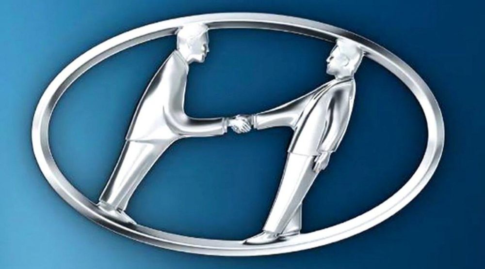
A Deeper Look Into The Hyundai Logo India’s second-largest manufacturer, and a global leader in the automotive industry, Hyundai is a brand that makes its presence felt around the globe. The logo of Hyundai is the letter H letter laid out in an italics fashion which is embedded into an oval. As per the company, the Hyundai logo is designed to represent two human figures: that symbolizes the company on one hand and the customer on the other. When seen carefully, the two seems to be shaking hands symbolizing mutual respect and trust.
The colour combination in the Hyundai logo is taken up keeping in mind the brand philosophy. While the blue colour represents reliability, excellence, and supremacy, the silver colour reflects creativity and sophistication.
-
Toyota
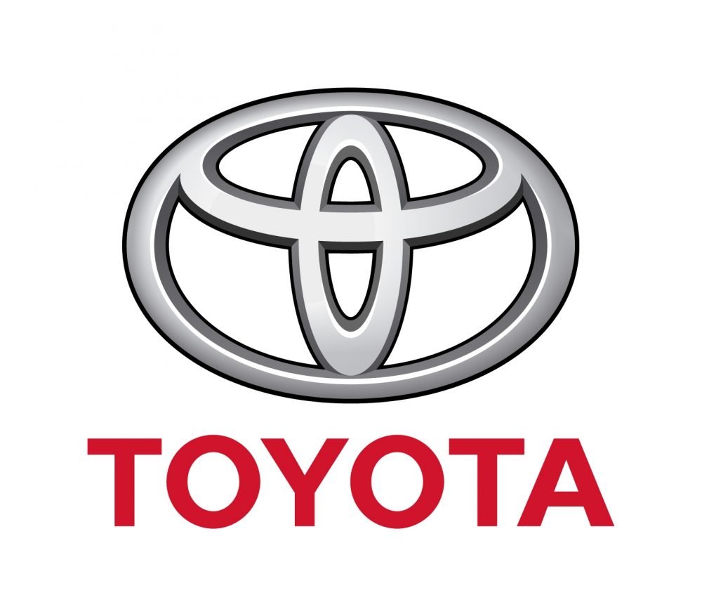
The Toyota Logo A subsidiary of Toyota Motor Corporation, the Toyota Kirloskar Motor is the fourth-largest automaker in India. Globally, the brand is synonymous with supreme quality and trust. The Toyota Logo is an emblem is a symbol that instantly strikes a chord, no matter where it exists.
The Toyota logo is made up of three ovals that are arranged in a horizontally symmetrical manner. The two perpendicular ovals, positioned inside the larger oval are symbolic of the customer’s heart and the company’s heart. These two ovals are beautifully overlapped with each other to showcase a win-win relationship between the company and its customers. But that’s not all, the largest oval represent the wide world that embraces Toyota. If you notice carefully, each oval is designed with a different stroke, which has its roots in the Japanese Brush Art culture.
-
Honda
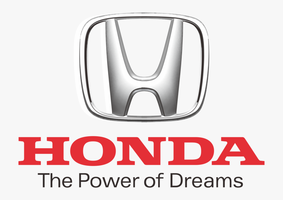
The Honda Logo Honda is also one of the leading car manufacturers in India and abroad with a wide range of vehicles successfully running in the country. The logo of the company is a simple and effective one that leaves no doubts or confusions. The logo includes the capital letter H in the simplest design. The thickness and width of the letter “H” reflect durability, reliability, and trustworthiness. But if you happen to notice the logo carefully, the H is narrower at the bottom and broader as it progresses, which looks like arms rising towards the sky. This represents the company’s motto: “The Power of Dreams”.
So these were 5 iconic logos and the vision behind them. If the story behind these logos inspired you, then tell us in the comment section below and we’ll do another version for you since there are hundreds of logo’s waiting to be unravelled. Till then, stay pinned!
Stay Updated: Hero MotoCorp Temporarily Halts Production, Here’s Why!

Love Reading? Follow us on Google News! Also Read: Can A Car With No Driver Crash? Tesla’s Autopilot Explained!

Where is bmw logo. It also have a great history behind its logo.